Overview
I am creating an app for art gallery patrons and other art history enthusiasts to dig deeper into the existing artworks, to obtain a more rich experience while touring the gallery; and to take art home in a fun way through trivia, which will also allow them to connect to other users.
This is a personal initiative.
Roles
UX Research
UX Design
UI Design
Date
2023
Tools
Paper, templates from Google, Slides, Spreadsheets, Miro, Zoom, Maze, Figma.
Process
Defining personas
User stories
As a busy working mother, I want to have meaningful interactions with my daughter based on her interests, so that I can strengthen our relationship even if we’re apart.
___________
As a regular visitor to art galleries and museums, I want to have facts and information at hand, so that I can enjoy the exhibitions with a complete context.
Competitive Audit
The goal of the competitive audit was to compare the user experience of the art history app. I identified the key competitors, who are Google Arts and Culture, a large app for everyone, with lots of features; Learn Art History and Painting, smaller, to the point with many languages available; Art Quiz & Trivia: Art History, a quiz game for art lovers. Lots of questions and answers about art and art history; and the Tate Modern, which we consider indirect because it is aimed at people visiting in person.
After analysing their strengths and weaknesses, I found some gaps and opportunities my app could take advantage of. Mainly consider accessibility features and have a strong navigation.
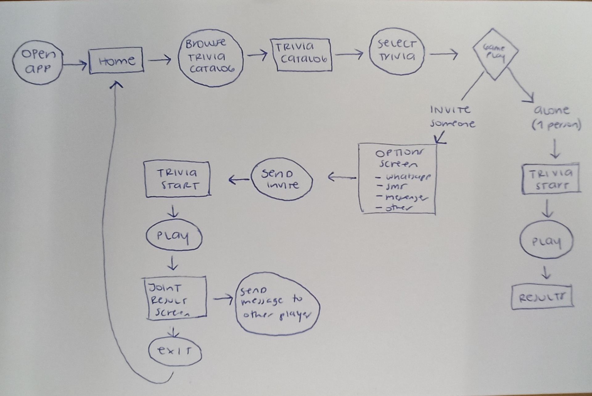
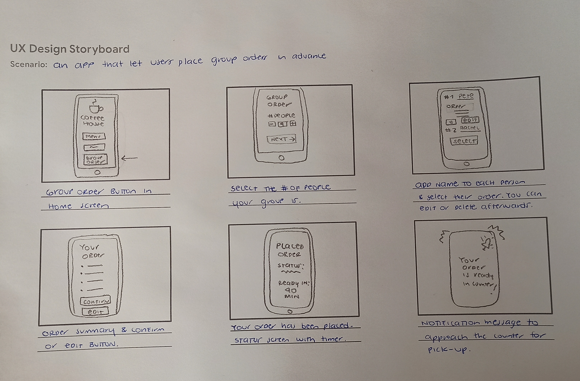
User flow and storyboards
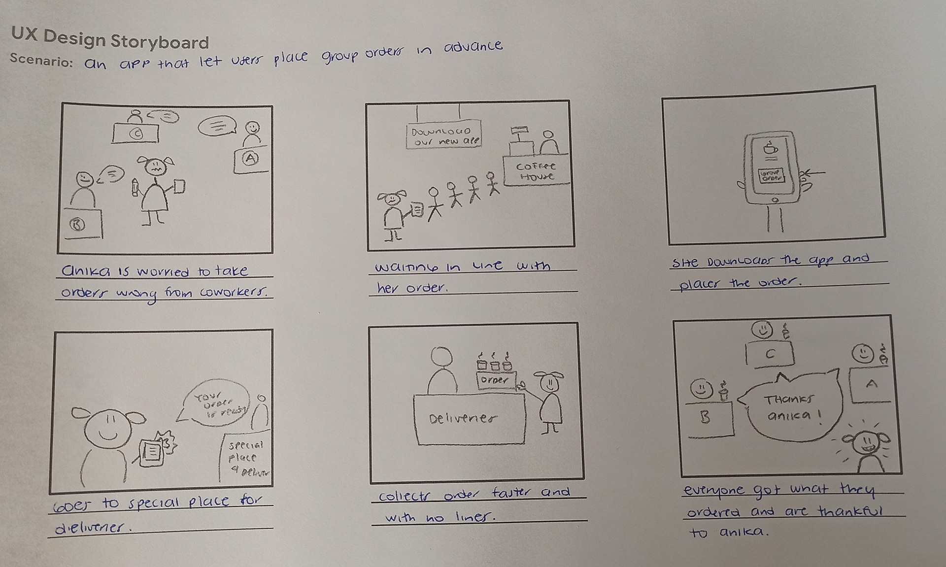
Paper Wireframes
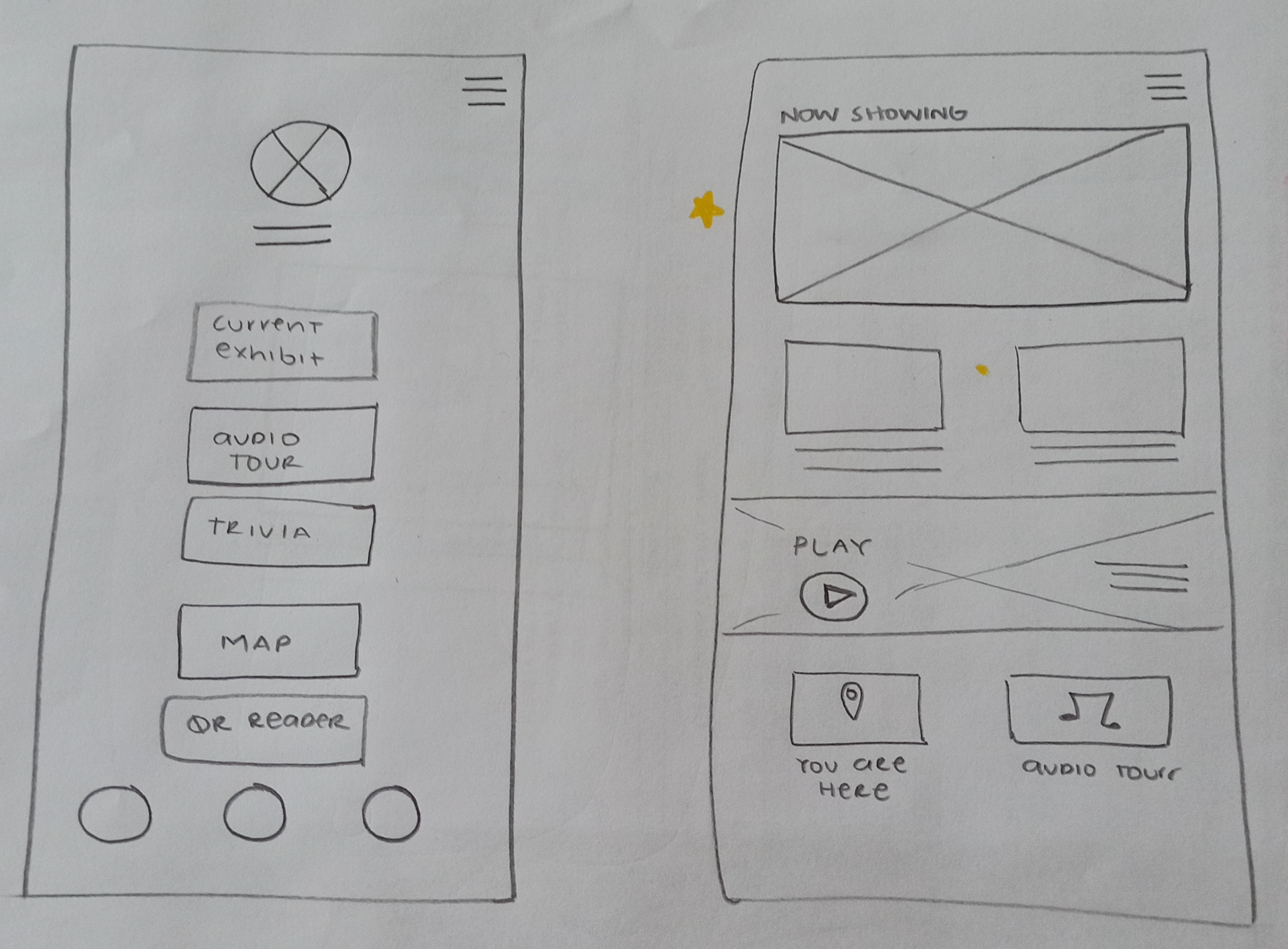
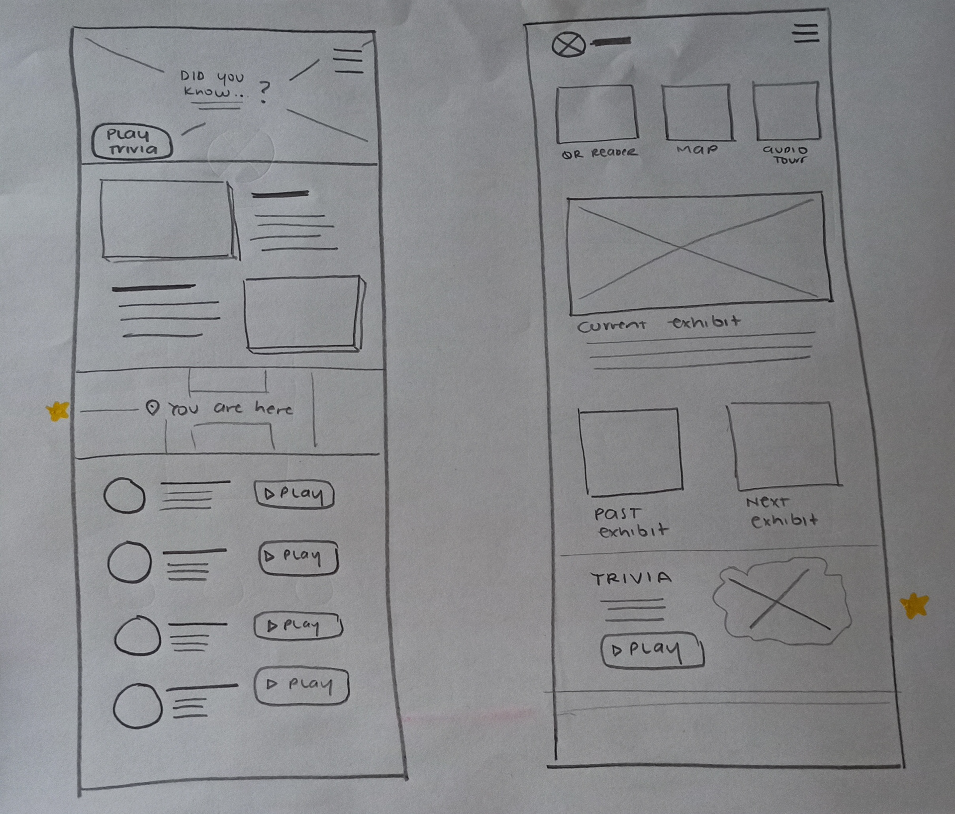
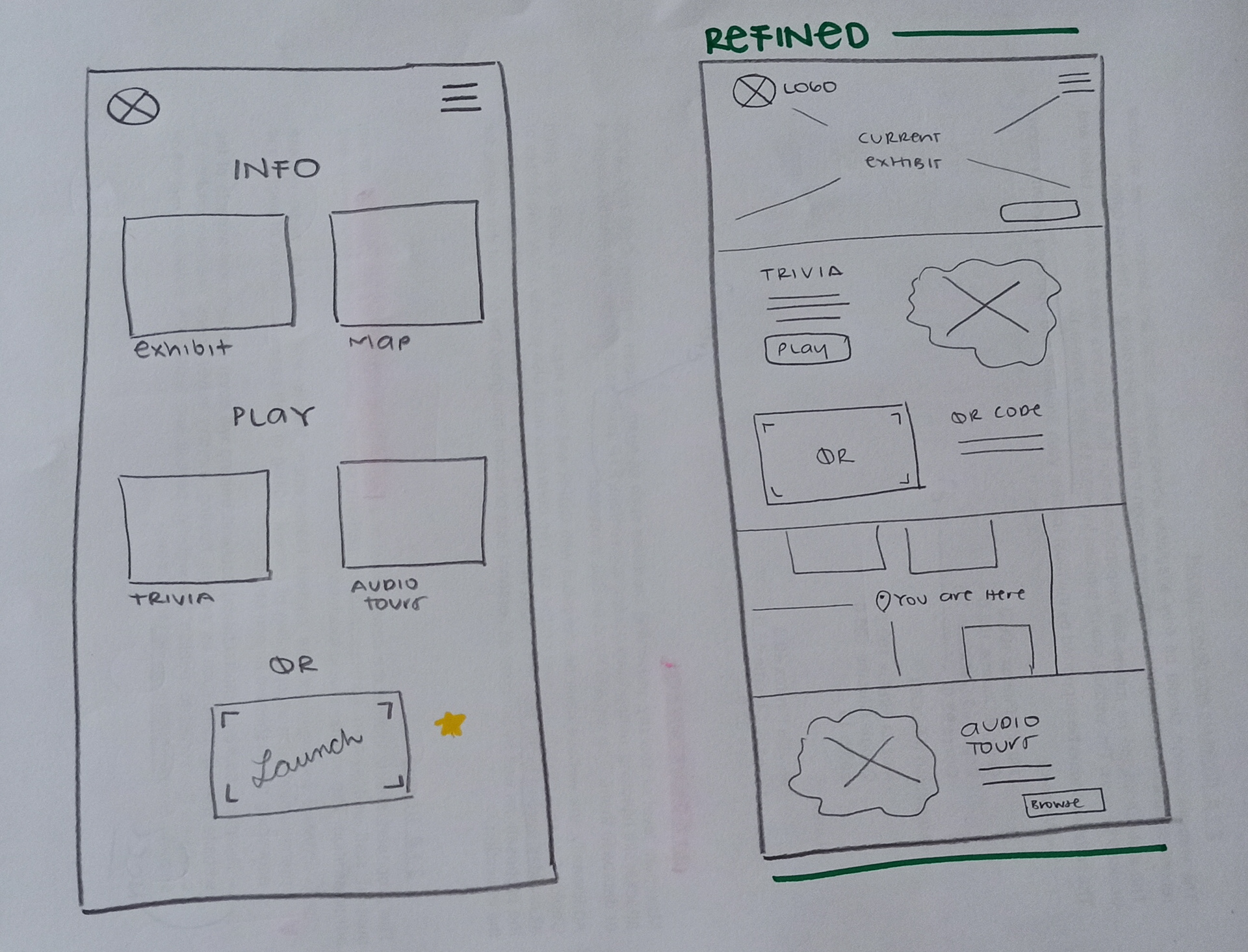
Digital wireframes and low-fi prototype
Usability Study
The first step to testing the low-fi prototype was to create a study plan. The plan includes background, research goals and questions, KPIs, methodology, a description of the participants and the script for conducting the sessions.
Initial desires had to be set aside, with only female friends being willing to take part. My learning goals were successful even if the participant pool was not the ideal diverse one I had thought of.
I ran an unmoderated usability study with 5 participants to answer the following research questions:
Are there steps in the journey where users get stuck?
Are there interface elements confusing for the users?
How do the messages make the users feel?
How useful is the app perceived?
Are there interface elements confusing for the users?
How do the messages make the users feel?
How useful is the app perceived?
I used Maze to conduct the study. After each prompt, an opinion scale of 5 steps on how easy or hard was each task, would appear on the screen. The study was done remotely through Zoom.
Once the research was completed, I compared and compiled my notes using an affinity diagram in order to identify patterns, themes and insights.
With the insights and priorities defined, a second version of the wireframes and prototype was created, along with the second research presentation.
Naming and colors
I wanted a one-word name for the app. Something memorable, related to art and culture.
Clio (Kleio), is the muse of history in Greek mythology. Her symbols can be a lyre, scrolls, or books.
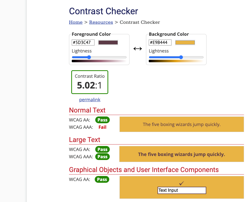
The color inspiration comes from an antique fresco from Pompeii, depicting Clio. I was specially drawn to the gradient colors in her tunic, that go from pink and burgundy to blue and green. Now, I needed to select some colors and check for accessibility in combination with typography. I particularly enjoyed this step in projects I’ve collaborated, selecting a color palette.
Mockups
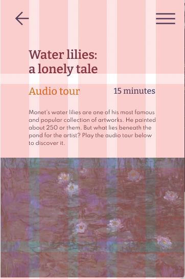
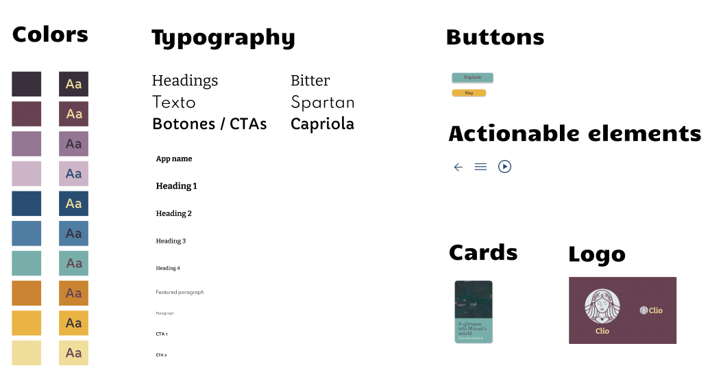
I've been learning a lot about user interface design and design systems. I created mockups following the colors, typography and other guidelines I chose.
High-fidelity prototypes and second usability study
After polishing the mockup screens, I developed a hi-fi prototype. I conducted thorough testing on it prior to organizing and executing a second usability study, involving a distinct group of participants while still utilizing Maze for the evaluation.
For this iteration, my research questions were:
Does the visual appearance and overall aesthetic provide a unified user experience?
Are the use of fonts and colors easy to use? How do they make the user feel?
Is the trivia engaging enough?
How useful is the app perceived?
Once again, the findings from the study yielded insights and actionable feedback to enhance the prototype. I incorporated these improvements before finalizing the designs, which I now deem ready for handoff.Quotes
From peers:
"Very straightforward and very well organized"
"The information architecture is very good"
___________
From study participants:
"The design is pretty intuitive, I think it works"
___________
